Hi, I'm Kyle.
I design the products
Consumer software used by 18M+ people, in a $60M ecosystem built from pre-revenue. I design it end to end, web to native, and build hands-on with AI. Currently SVP of User Experience at Sovren Technologies.
 Kyle McCarthy · Dallas
The products I'm proudest of are the ones I'd hand to the people I love. I sweat the details until they feel right, because at scale the smallest decisions carry the most weight.
Four consumer products. One connected ecosystem.
A home feed creators open every day.
A creator-first network had to scale from someone's first post to a full-time creator without ever feeling heavy. I designed the core surface: feed, Stories, Bursts, live Lounges, profiles, messaging, plus the Studio and ad tools behind it. Part of an ecosystem reaching 18M+ people.
Read the case study →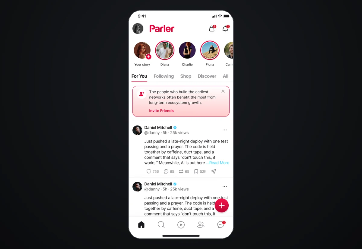
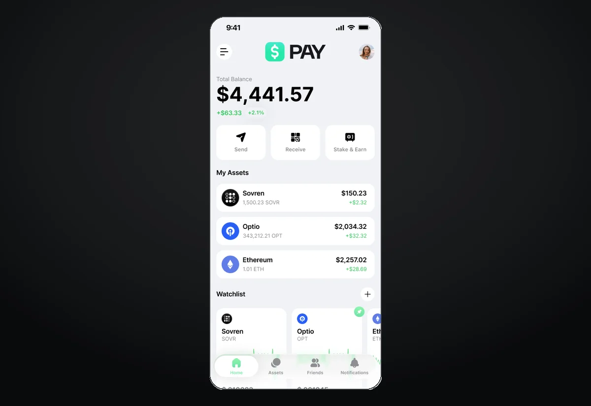
Money that feels social, not scary.
A non-custodial wallet that doubles as a social network, and the checkout that powers Shop. Self-custody, made social.
View case →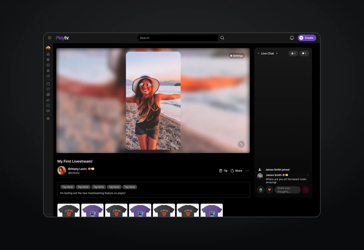
Every way to make video, one workflow.
Short-form, long-form and livestream creation, plus the path to getting paid and a storefront on every profile.
View case →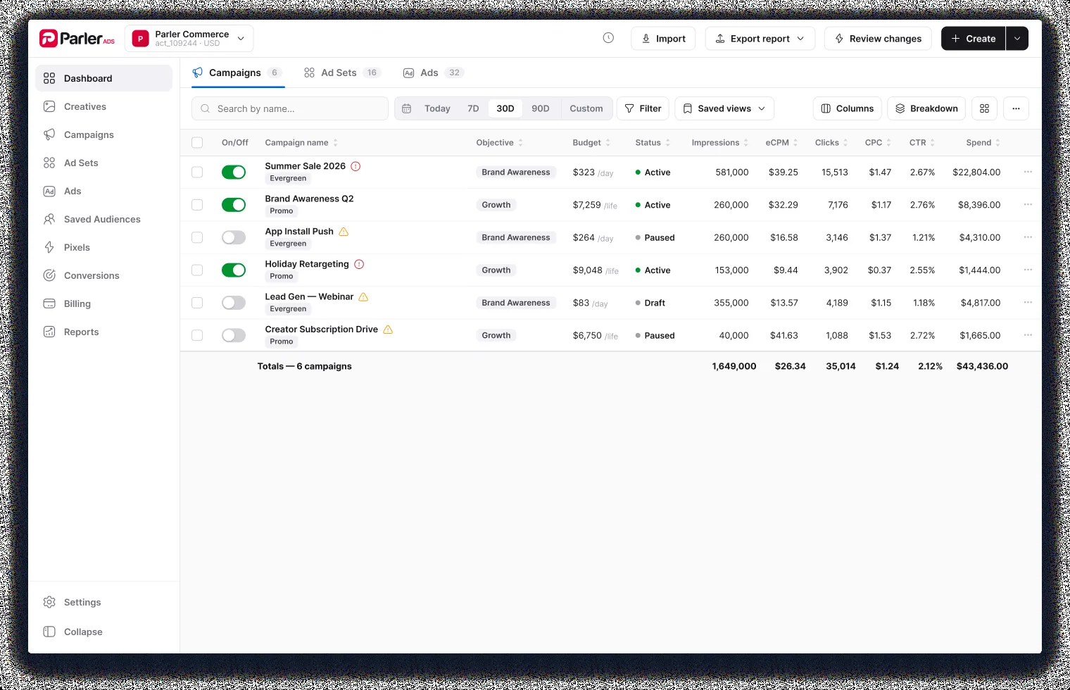
The engine that funds the feed.
A self-serve ad platform: one advertiser experience across the feed, video and beyond, built hands-on with AI.
View case →I design for the moment a product earns a place in someone's day, and the trust that keeps them coming back.
Most recently I led experience across four flagship products in one connected ecosystem: a social network, a payments wallet, a video platform and a creator marketplace, shipping on web, iOS and Android alongside a 100+ engineer org. I work end to end: the research, the system that holds it together, and the last pixel. Years inside feeds, identity and trust & safety taught me where the weight really sits.
I also build. I prototype hands-on with AI (Claude, Figma AI, Grok, Replit), turning an idea into testable product in days, not weeks.
CrushSuite
I don't just design products. I run one. CrushSuite is a suite of Shopify apps that lets wineries sell wine online, compliantly. It handles the state rules, age gates and shipping fees that make direct-to-consumer wine so hard, right inside Shopify's checkout, and runs wine clubs with releases, subscriptions and member management. I designed and shipped it end to end, from first prototype to a 5.0-rated app on the Shopify App Store. Next up: a conversational-AI wine assistant we're building now.
Visit CrushSuite ↗Whatever it takes to get it right. For the person using it, and the business behind it.


